
OBJECT STORIES
OBJECT STORIES
Object Stories are an intimate look at Bard Graduate Center exhibitions, one object at a time. We invite you to listen closely as Gallery Educators from our MA and PhD degree programs and Teen Scholars explore objects from Eileen Gray, bringing a myriad of perspectives to the interpretation of these unique objects.
Object Stories are an intimate look at Bard Graduate Center exhibitions, one object at a time. We invite you to listen closely as Gallery Educators from our MA and PhD degree programs and Teen Scholars explore objects from Eileen Gray, bringing a myriad of perspectives to the interpretation of these unique objects.
BRICK SCREEN
BRICK SCREEN

Eileen Gray (1878–1976)
Screen for Chambre à coucher boudoir pour Monte-Carlo (Bedroom/Boudoir for Monte Carlo)
1923
Wood, white paint
Approx. 83 1/2 x 63 in. (212 x 160 cm)
National Museum of Ireland, NMIEG 2000.10
Folded photos: Bruce White
Object Stories are an intimate look at BGC exhibitions, one object at a time. My name is Nicholas de Godoy Lopes; I’m a doctoral student in the BGC Program, and I’m here to speak about the Screen for the Chambre à coucher boudoir pour Monte-Carlo designed by Eileen Gray in 1923.
One thing that I always do when I see this screen is try to imagine it from different positions. The off-setting of the painted rectangular panels creates an interesting interplay of empty and filled spaces that looks different from every angle and makes beautiful shadows as the light passes through it. Gray made several versions of this screen for various interiors. This one was exhibited in a model “boudoir” or bedroom that Gray designed in 1923 for a decorative art exhibition. Try to imagine this screen in a bedroom. What does that room look like?
Gray was very interested in designing objects and interiors that were convenient and flexible. Screens feature prominently in her work because they were movable and allowed for the client to divide their space however they wanted. Gray’s objects were also often personalized, which made her work stand out at a time when many designers were working with standardized products. Each of her Brick Screens, as these screens are often called, are different, though this one is particularly unique because it uses white paint instead of black lacquer. If you had a screen such as this, what room would you put it in and how would you arrange it?
When Eileen Gray became more interested in architecture in the second half of the 1920s, screens were replaced in many of her projects with cabinets. These pieces reflected her interest in multifunctional objects, as they both stored things and doubled as space dividers. Gray was somewhat unique among contemporary architects in her interest in creating flexible, personable living spaces, which is one of the reasons her work resonates so much with me. Think about your own home. How do you divide space and make areas that are more private or personal?
The White Screen reminds me how important objects can be when it comes to making our homes dynamic and vibrant, just like us! It always stops me in my tracks when I see it.
Thanks for joining me for Object Stories!
Nicholas de Godoy Lopes is a first-year PhD student at BGC specializing in nineteenth- and early-twentieth-century European and American design. Nicholas previously studied at Parsons School of Design, where he earned a Master’s in the History of Design and Curatorial Studies. His greatest fascination is ornament and decoration.
TRANSAT CHAIR
TRANSAT CHAIR
Eileen Gray (1878–1976)
Fauteuil Transat (Transat chair) owned by the Maharajah of Indore
1930
Lacquered wood, nickel-plated brass, leather, canvas
29 1/8 x 20 x 35 in. (74 x 51 x 89 cm)
Private collection
Photo: Copyright 2014 Phillips Auctioneers LLC. All Rights Reserved
Hi there! I’m Endie, a Teen Thinker here at the Bard Graduate Center. Eileen Gray’s Transat Chair, created in 1926-1929, embodies her craftsmanship and pioneer work in Modernist design. The chair has a curved faux leather seat with an adjustable headrest and is encased in a black lacquer frame. Gray’s work in furniture design personifies her philosophies and talent as a creator and designer. The Transat chair adopted the changing of the tides; it reflected the necessity driven mindset following the first world war in its simplistic form. In Gray’s words, “Nowhere did we attempt to create a line or a form for its own sake; everywhere we thought of the human being, his sensibility, his needs.” Individually, each Transat chair was made specific for each client. No two chairs were exactly alike, each was customized and tailored for the person, demonstrating Gray’s mastery of her materials. It’s for these very reasons — the bespoke nature, the aesthetics, this being a representation of Gray’s capacity as a furniture designer — that this object has impact.
Born and raised in New York City, Endie Hwang is a high school senior at the Eleanor Roosevelt High School. She is interested in anthropology, history, and art history. As a young adult, she seeks to understand the root of the chaoticism of the 21st century through the study of global philosophies, cultures, and the world’s history. In her free time she volunteers at art museums, bakes, and watches (ironically bad) movies. Inspired by Legally Blonde, Endie advocates for equal rights on the basis of sex and race as well as for the environment. She will be attending Wake Forest University in the fall.

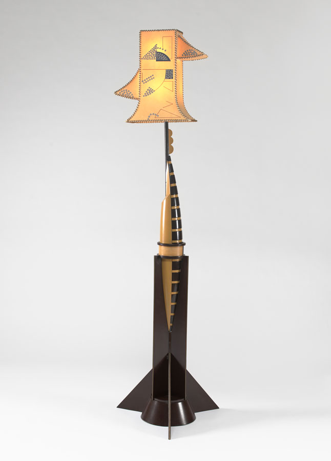
ROCKET LAMP
ROCKET LAMP
VMFA_gray_85-169_v1KW200909 NEW")
Eileen Gray (1878–1976)
“Rocket” floor lamp
1923
Lacquer, wood, painted parchment shade (modern replacement), electrical parts
73 x 20 1/2 in. (185.4 x 52 cm)
Virginia Museum of Fine Arts, Richmond, Gift of Sydney and Frances Lewis, 85.169a-c
Hello! My name is Jess. I’m a museum educator and I’m here to talk a little bit about the “Rocket” Lamp designed by Eileen Gray.
What does function mean to you? Can a functional object still be designed in a way that is thoughtful, elegant, and unique? Thinking about functional design and the extent that creativity can be applied to objects that we all use in our daily lives, let’s delve into this quirky lamp designed by Eileen Gray.
This brings us to the fascinating “Rocket” lamp we see here. Designed and first shown in Paris in 1923, this lamp is thoughtfully placed in the Boudoir for Monte Carlo that Gray designed.
Made of a dark wood, the base that sits on the floor is angular and has hard edges, directly juxtaposed to the sleek, rounded body in the middle. The center component of the lamp, composed of a light wood on the left with dark stripes on the right, sits comfortably in the bottom sleeve; a feature which gives us the allusion of a rocket. The lampshade, a painted vellum, is tall and flares at the end. Arguably the most interesting part of the object, the lamp shade has two additional triangular pieces on either side. Paired with the geometric designs that are hand painted onto the shade, this feature evokes a face to me. Almost a snapshot in time, I wish I could press play on this lamp to see the rocket take off from its pointed base, shooting up towards its odd lampshade, right through the roof of the Monte Carlo.
Keeping in mind how consistently Gray incorporates function with the design of the pieces she created, it is interesting to think of the interplay of the funky design of this lamp with its useful, everyday function. Looking at the relationship of the lamp with the room in which it is placed- How is this object speaking with other objects in the room? I notice the other light in the room, a blue geometric fixture that seems to be aligned with the shade on our rocket lamp. The calming blue color makes me think this hanging fixture has a more passive personality then the loud persona of the rocket lamp.
Furthermore, let’s stretch our imaginations to presume the personality of this lamp. What characteristics does it take on? I imagine that it’s extroverted, outgoing in its mannerisms. So strikingly humane, this rocket lamp can evoke many personality traits if we look deeply.
Perhaps it reminds you of someone in your life? An eccentric professor I had in undergrad seems to have been embodied by this lamp- he had quite an unconventional personality that I see reflected in this object.
Think about your living space at home- would this lamp fit? Do you already have an object at home that doubles equally in both functionality and design?
Does this object have a personality, and if so, how do you know? What are the features of an object that tell us about its personality? Is it the material it is made of, is it the size or is it the color? Perhaps the textures and features of its physical touch tell us about the object’s overall demeanor. Think of that functional object you have at home. What would it say if it could talk? How do everyday objects come to life in your home?
I hope you carry these questions with you and find ways to bring objects to life.
Thanks for joining me for Object Stories!
My name is Jess Fiore and I am a museum educator. With a Bachelor’s degree in Art Education, I have always found myself drawn to the ways that artwork can tell stories. I find pleasure in helping others to see art in a new light. While I am working towards my Master’s in Museum Education at the City College of New York I find myself falling in love with museums all over again and all of the different ways we can learn from objects. As an educator, I love to learn along with my students in order to optimize our museum experience together. In my free time, I like to work on my embroidery projects and practice my pottery wheel skills.
E 1027
E 1027
Eileen Gray (1878–1976) and Jean Badovici (1893–1956)
View of the south façade of E 1027 from the sea, Roquebrune-Cap-Martin, France
Unknown date
Photo: Centre Pompidou, Bibliothèque Kandinsky, Paris. Fonds Eileen Gray.
My name is Sadia, one of the BGC’s Teen Thinkers! Here we have Gray’s most famous piece of built architecture and her first, the E 1027 vacation house in France. It was built from 1926 to 1929 with and for her good friend Jean Badovici to be lived in. The name E 1027 comes from a code translation of their initials, E-J-B-G, an effort to set their collaborative spirit somewhat in stone. It features, above all, function in the everyday routine and separated space for private and public matters. Outside of the architecture, this famous E 1027 vacation house looking out onto the Mediterranean sea caught the attention of one Le Corbusier, the more well known Swiss-French architect, and a friend of Badovici. Le Corbusier became enormously jealous of the house Gray and Badovici designed, and upon being invited to it by Badovici, he painted colorful murals on the walls without Gray’s permission. As such, the credit for E 1027 was primarily afforded to Badovici and even Le Corbusier just about until Joseph Rykwert’s 1967 essay restored it to Gray. This exhibit is an excellent way to represent Gray’s contributions as a female architect in the face of a history that tries to take her legacy from her.
Sadia is a high school junior attending Bard High School Early College Manhattan. She is a BGC Teen Thinker alum where she did original object research engaging in interdisciplinary modes of interpretation of material in the everyday. She is otherwise interested in studying philosophy, history, mathematics, physics, and psychology and attempts to blur the lines between such topics in the hopes of attaining a more holistic understanding of the world. During her free time, you can catch her cooking, playing with small furry animals, reading, hiking, camping, interviewing interesting people and occasionally indulging in terrible reality television.

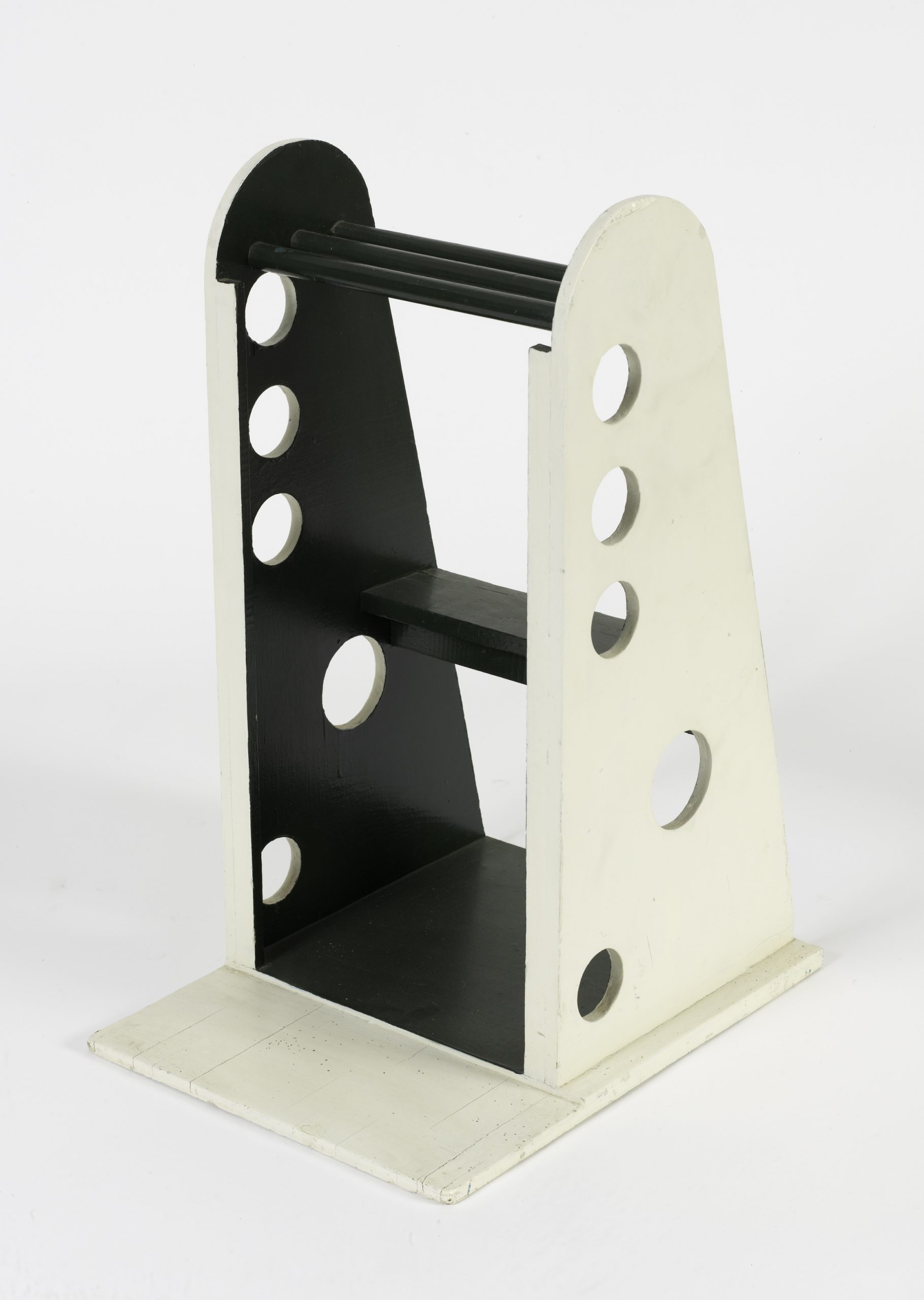
SEAT-STEPSTOOL-TOWEL RACK
SEAT-STEPSTOOL-TOWEL RACK

Eileen Gray (1878–1976)
Siège-escabeau-porte-serviettes (Seat–stepstool–towel rack)
1930–33
Painted wood
27 5/8 x 15 x 19 5/8 in. (70 x 38 x 50 cm)
Collection Gilles Peyroulet, Paris
Photo: Bertrand Prévost
Hello everyone, my name is Keviin and I am a Teen Thinker at the Bard Graduate Center. The object you are seeing was created by Eileen Gray, a designer, and architect from the 20th century. At first glance, it may be unclear what this object is or the purpose it serves, but Gray’s title for the object, “Siège-escabeau-porte-serviettes”, translated to Seat-step stool-towel rack, offers a clue. The wooden object from the 1930’s is a small, multipurpose, useful piece of furniture, ideal for small apartments and living spaces. Its two steps make the object easy to sit on or to use as a small ladder, but the holes on the side allow for users to dry their towels simultaneously. Gray was dedicated to maximizing use and minimizing space in order to create an efficient lifestyle. An object such as the Seat-step stool-towel rack was evident of that. I chose this object because I thought the designated audience for this object–Eileen Gray herself–was extremely different from some of her other audiences for more luxurious objects like the Transat Chair. I think this speaks to Gray’s range and brilliance as she showed the ability to design for all kinds of people.
Keviin is a senior at Bard High School Early College Queens, but will be heading off to NYU for his higher education in a few months. Some of Keviin’s interests include watching Bollywood movies, seeing cricket highlights, and listening to music. He also really enjoys traveling and doing research into computer languages with his current project revolving around how to make a web scraper on Python.
CABINET WITH PIVOTING DRAWERS
CABINET WITH PIVOTING DRAWERS
Eileen Gray (1878–1976)
Cabinet à tiroirs pivotants (Cabinet with pivoting drawers)
1934–35
Painted wood and painted metal
27 3/4 x 20 1/4 x 20 1/4 in. (70.5 x 51.5 x 51.5 cm)
Collection Jacques De Vos, Paris
Object Stories are an intimate look at BGC exhibitions, one object at a time.
Hi! My name is Jordane Birkett. I’m a museum educator and I’m here to speak about the Cabinet with Pivoting Drawers designed by Eileen Gray.
Eileen Gray designed this cabinet between 1934 and 1935. Two sides of the cabinet each have three stacked drawers, which pivot out from the main structure. Eileen Gray devised this cabinet for Tempe a Pailla, a personal home she began building for herself in 1931. Located in Menton, France, Tempe a Pailla was compact and efficient. Despite its modest size, Gray prioritized airflow, exterior views, and light. Tempe a Pailla is a unique space. Gray conceived it to have ‘architectural layers,’ meaning that you could interact with the same room in multiple ways. Gray’s furniture was an important part of activating the space. Many pieces had more than one function, or could be moved from place to place. A single room in the house could be easily transformed based on the furniture inside.
The Cabinet with Pivoting Drawers is one such piece of furniture that blurred the line between different spaces, activating the house. Take a moment to notice the cabinet’s feet. On one side of the cabinet, the feet are taller than on the other side. This was a deliberate choice. Gray intended the cabinet to be placed in between two rooms. Since there was a step up into one of the rooms, Gray designed the cabinet to accommodate this by mismatching the feet. The cabinet was functional in other ways, too. When closed, the cabinet is a compact cube, maximizing space. However, when the drawers swing open, the objects stored inside are easily accessible. Let’s think about how this object might change the space. Does connecting two rooms make the interior more free or active? How might you move around this object if all its drawers were open?
Let’s take a look at some of the materials Gray used. Do you notice how the top of the cabinet, and bottoms of the drawers are made of glass? This was a useful feature when the drawers were closed – instead of opening them up, you could glance into the top of the cabinet through the glass to see what was inside. Do you think Gray’s use of glass changes, or adds to the design? For example, maybe the glass makes it easier to clean the cabinet. Maybe you wouldn’t want to store personal objects in the glass drawers. Gray’s cabinet is clearly versatile and compelling. Today, we continue to see how its design and materiality encouraged function, efficiency, and personalization.
Thank you for joining me for Object Stories!
Jordane Birkett is a second year master’s student at Bard Graduate Center, an educator at the BGC gallery and teaches the Teen Curators program at Hill Art Foundation. Jordan’s research interests at BGC are focused on the late work of William Morris and the intersections of physical and intellectual craftsmanship. She is interested in examining the ways we use objects to shape our daily lives, and how this principle can help foster expanding definitions of art.

AUM MANE PADME AUM PANEL
AUM MANE PADME AUM PANEL

Eileen Gray (1878–1976)
Overmantel panel, Aum Mane Padme Aum, also known as Le Magicien de la nuit (Magician of the night)
1912–13
Red and black Chinese lacquer, mother-of-pearl
25 5/8 x 31 7/8 in. (65 x 81 cm)
Private collection
Object Stories are an intimate look at BGC exhibitions, one object at a time.
Hi! My name is Geoffrey Ripert. I’m a museum educator and I’m here to speak about Aum Mane Padme Aum, designed by Eileen Gray.
Look carefully at this panel. Notice the format, function, and the use of materials. This is an overmantel, a decorative work designed to be hung above a fireplace in a wealthy owner’s home. The frame that currently adorns the panel reinforces this decorative function intended by its designer. The composition is formed by three loosely defined figures, cut off at the hip, and set against the plain red background. The figure on the right hand side presents a cloth to the figure in the center, almost completely nude, who in turn holds up a flower, a lotus, to the figure on the left. The gestures of this third figure seem to welcome the flower as a gift. When making this panel, Gray would have known that Japanese screens and handscrolls traditionally read from right to left, with the narrative progressively unfolding along the way. She was likely inspired by this tradition when making this panel. However, the nature of this composition tempts the eye to dart from one detail to the next, lending additional dynamism to the scene.
Which hands, sources, or origins might have contributed to this work? The title, Aum Mane Padme Aum, gives us a clue. It is a reference to a Tibetan Buddhist mantra, describing the lotus as a conduit for reaching enlightenment. The alternative title, Le Magicien de la nuit, or Magician of the Night, could have been adopted to better convey the sense of mystery and esotericism Gray and western audiences would have associated with such a work when it was created in 1912.
Look carefully at this panel again. Is this work modern or traditional? Lacquer, the substance used to make it, originates from Asia. Eileen Gray benefited from a close collaboration with Seizo Sugawara, a highly esteemed Japanese émigré lacquerer, working in Paris at the turn of the twentieth century. It was under his guiding influence that Gray was able to learn the sophisticated techniques of traditional Japanese lacquer-making. However, in this panel, Gray chose to subvert this creative process by using base layers of red and black lacquer as a finish, and for a decorative panel, rather than furniture or objects, as Japanese artisans would traditionally have employed it for. The viewer is left to wonder how extensive the role of Sugawara might have been, given the importance of works in lacquer—such as this panel—in Gray’s early career. This beautiful work bears witness to the considerable influence Asia exerted on European art at this time. Through this decorative panel, Eileen Gray allows the viewer to witness a synthesis of this Asian influence, transformed through the eyes and hands of an independent, aristocratic, western female artist of great talent.
Thanks for joining me for Object Stories!
My name is Geoffrey Ripert, I’m a first-year PhD student at Bard Graduate Center. My research interests span eighteenth-century French Decorative Arts and the history of collecting, particularly the taste for, function and display of hardstone objects in the secular interior. I’m also interested in the survival of Greco-Roman antiquity in the material culture of early modern Europe. Previously, I was Curatorial Assistant for Decorative Arts at The Frick Collection for four years. I hold an M.A. from the Ecole du Louvre, an M.A. from the Ecole Pratique des Hautes Etudes, and a B.A. from the Sorbonne.
LACQUER SCREEN
LACQUER SCREEN
Eileen Gray (1878–1976)
Screen
ca. 1921–23
Incised wood with brown and tan lacquer
78 x 102 in. (190 × 260 cm)
Collection of Kelly Gallery and Stephen Kelly, New York
Object Stories are an intimate look at BGC exhibitions, one object at a time. Hi! My name is Hana Pyzik. I’m a museum educator and I’m here to speak about a Screen designed by Eileen Gray.
Eileen Gray’s work in lacquer began early in her career, after seeing beautiful examples of Japanese art and lacquer in museums in the early 1900’s. After working briefly in Dean Charles’ restoration studio in Britain, Gray moved to Paris in 1906 where she trained with the Japanese lacquer master, Seizo Sugawara.
What stands out to you when you first see this lacquer screen? To me, the dark color of the screen makes me feel calm and relaxed. Slow curving lines and intricate patterns cover the surface of the screen and demonstrate Gray’s turn from figural lacquer work towards more abstracted imagery. Take a close look at the geometric designs on the surface, how does it look like she made those designs? Rather than adding a design on top of the wood, the designer incised them, cutting into the wood to create a varied surface pattern. This screen showcases Gray’s mastery of design principles and technical lacquer work. Gray understood how to manipulate materials and create objects that were both functional and beautiful at the same time.
Think about how this screen would look in your home, does the size and design work well in your space? Would the screen function in the room or would it overwhelm the other furniture in your space? Eileen Gray was drawn to lacquer early in her career, but turned her attention to different materials as she progressed as a designer and architect. If you were going to create a screen, what materials would you choose and what would you use it for? I might choose something light like bamboo so I could easily move it to different rooms.
Hana Pyzik is a first-year MA student at City College of New York. Hana is studying to be a museum educator, following her passions for both art history and education. As a future museum professional, she wants to contribute to accessible educational initiatives and programming in museums.

SCREEN PROTOTYPE
SCREEN PROTOTYPE

Eileen Gray (1878–1976)
Screen prototype
ca. 1918
Ebonized wood, metal
H 30 3/8 in. (196 cm)
Galerie Vallois, Paris
Photo: Arnaud Carpentier
Hi! My name is Zoe Bunce and I am a Teen Thinker. I am going to talk about this “Brick” Screen Prototype. This prototype was made by Eileen Gray early in her career in 1918 as a gift for Jean Badovici, a collaborator and friend. She made this screen using lacquer and furniture making techniques. Eileen Gray explored many different media in her life. She started her artistic career with lacquer work, which is a finish that is layered on to wood, metal, ect., in this case, wood, to create a shiny and protective exterior. Gray learned lacquer work from the Japanese lacquer master – Sugawara Seizo, who taught her the traditional Japanese methods of lacquer making as well as screen making. Screens were Gray’s first step into the furniture-making world. This screen, in particular, shows Gray’s fascination with creating movement through design. She filters light through the gaps in this screen and creates a mathematical pattern that lends itself to a beautiful shadow. This prototype only has 10 layers of roiro, or black lacquer, while typical lacquer work has at least 20 layers and Gray’s completed brick screens had 50 layers! This piece relies solely on its structure and shiny black lacquer to make it beautiful, Gray does not add any other motif or distraction, instead, she allows the lacquer to be at the center of her design. I chose the “Brick” Screen Prototype because it showcases the beginning of Gray’s career and also begins to establish the interdisciplinary nature of Gray’s creations, and her tendency to be the artist behind all elements of her pieces.
Zoe is a junior at Bard High School Early College Queens. She loves to paint, draw, and make pottery. She has been making pottery for the past eight years and really enjoys throwing pieces on the wheel that she can use in her home. Because of Zoe’s experience in making art for daily use, she is interested in learning how everyday objects can illustrate the lives of their users. Zoe believes that objects are a window to the past in the sense that they teach you about their owner. We are a material people, and it never fails to amaze her just how much information a simple object can hold.
TRANSAT CHAIR
TRANSAT CHAIR
Eileen Gray (1878–1976)
Fauteuil transat (Transat chair) owned by the Maharaja of Indore
1930
Lacquered wood, nickel-plated brass, leather, canvas
29 1/8 x 20 x 35 in. (74 x 51 x 89 cm)
Private collection
Photo: Copyright 2014 Phillips Auctioneers LLC. All Rights Reserved
Hi! My name is Will Neibergall. I’m a Master’s student and gallery educator at Bard Graduate Center. I’m here to talk about the Transat chair, designed by Eileen Gray.
The Transat chair, created as early as 1922, is one of Gray’s signature designs. Gray created twelve different copies of the chair before 1930, experimenting with different materials, finishes, and colors. The Maharaja, or “great ruler,” of Indore, a province of India, ordered one in black lacquer and brown leather, whereas the Romanian architect Jean Badovici, who had a close personal and professional relationship with Eileen Gray, chose black lacquer and plain coated canvas in celadon green. Gray also produced versions of the chair using sycamore in place of lacquer, and fabric or hide in place of leather and canvas.
The curators of our exhibition characterize the Transat chair as “offering respite from the frenzied pace of modernity,” and resisting “a world in search of speed,” in contrast to the message of canonized modernist designers like Le Corbusier, who described a house as a “machine for living.” Indeed, upon a cursory look at the form and materials of the chair, it might look naturally suited for relaxation, especially in contrast to the oppressive office and desk chairs we are so used to today. But take a closer look.
Personally, I see some of the “frenzied pace of modernity” and “world in search of speed,” or at least efficiency, in Gray’s conception and execution of this iconic chair. Unfinished metal fastenings peek out from the wood and lacquer construction. High armrests constrain the body nestled in the soft cradle of the seat. While this chair signals rest and relaxation, it also regulates the body, and situates it in a context wherein leisure and “homeliness” are conditioned by adherence to particular technical and spatial principles. Can you move freely in the Transat chair? Does it accommodate all of our bodies? No. But it serves perfectly as an example of Eileen Gray’s holistic view of modernism, balance, and objectivity in architecture and interior design, whether or not we feel free and comfortable sitting in it in our living room.
Thank you for joining me for Object Stories! Stay tuned for more of our stories about Eileen Gray.
Will Niebergall is a second year Masters student and gallery educator at Bard Graduate Center. He is interested in the history of modern architecture as it relates to the history and philosophy of science and technology.